

Quick answer:
A sticky glass navbar keeps your menu fixed while visitors scroll, uses backdrop-filter for a frosted-glass look, and a thin progress bar under the nav maps scroll depth so readers always know how far they are through the page. Below you get the full HTML, CSS, and JavaScript, plus a live demo and screenshots.
Want to see it before you copy anything? Open the live sticky glass navbar demo — scroll, resize, and open the mobile menu.
What you will build
This free Get Code pack ships a production-ready navigation pattern used on modern SaaS and agency sites:
- Sticky header that stays at the top of the viewport
- Frosted glass background that activates after a few pixels of scroll
- Gradient scroll-progress strip (amber → coral → teal)
- Active section highlighting as you scroll
- Responsive hamburger menu with an accessible drawer on mobile
- Friendly color system (warm amber CTAs, soft coral, cool teal on deep ink)
No frameworks. Pure HTML, CSS, and a small JavaScript module you can paste into WordPress (Custom HTML / Elementor HTML widget), Shopify, Webflow embed, or any static site.
Live preview screenshots
Desktop — hero with clean sticky bar
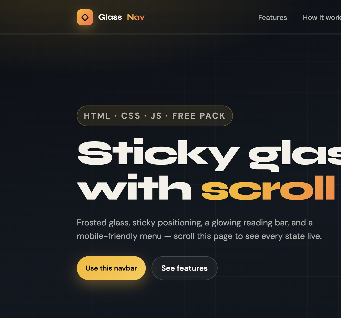
At the top of the page the bar stays light so the hero can breathe. The brand mark and amber CTA stay readable on the atmospheric background.
Desktop — glass state + scroll progress
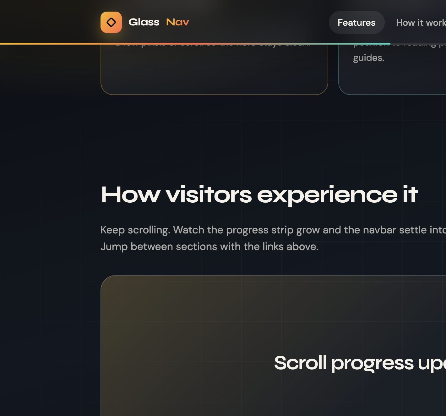
After you scroll, the navbar gains blur + translucent fill, a soft border, and the progress meter fills under the bar so visitors feel oriented on long pages.
Mobile — sticky bar + open menu
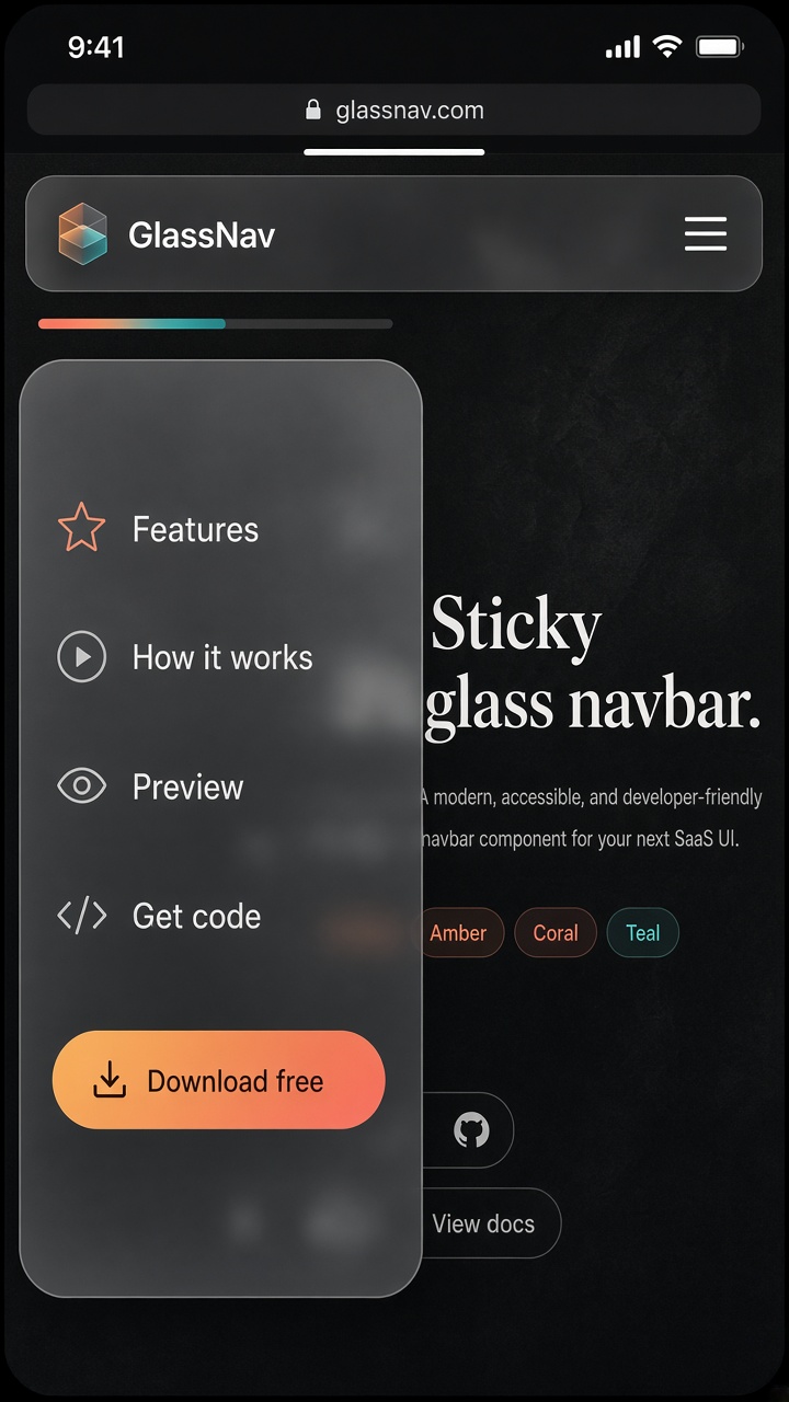
On small screens links collapse into a frosted drawer. The sticky bar and progress strip stay put — only the link list toggles.
Why this pattern converts
Sticky navigation reduces “lost” clicks on long landing pages. Glass styling signals a premium product without heavy shadows. A scroll-progress bar is a subtle engagement cue — especially useful on tutorials, pricing pages, and case studies.
At Let Start Design we use variations of this pattern on marketing sites when the brief calls for clarity, craft, and mobile comfort.
How to use this code (step-by-step)
- Create three files:
index.html,styles.css, andscript.js(or keep one HTML file with<style>+<script>like the demo). - Paste the HTML structure for the header and page sections.
- Paste the CSS variables and navbar rules. Keep the color tokens — swap them later to match your brand.
- Paste the JavaScript at the bottom of the body (or as a deferred module).
- Open
index.htmlin a browser. Scroll and resize to verify glass, progress, and mobile menu. - Replace
GlassNavwith your brand, updatehreftargets, and point the CTA to your real offer. - Optional: drop the same markup into an Elementor HTML widget or a WordPress Custom HTML block. Enqueue the CSS/JS through your theme or a code snippets plugin.
Tip:
For best glass blur support, serve the page over http:// or https:// (not always file://). Safari and Chromium both support backdrop-filter in modern versions.
HTML code
<header class="navbar" id="navbar">
  <div class="nav-inner">
    <a class="brand" href="#top">
      <span class="brand-mark" aria-hidden="true"><span></span></span>
      Glass<em>Nav</em>
    </a>

    <button
      class="menu-toggle"
      id="menuToggle"
      type="button"
      aria-label="Open menu"
      aria-expanded="false"
      aria-controls="navLinks"
    >
      <span></span>
    </button>

    <ul class="nav-links" id="navLinks">
      <li><a href="#features" data-nav>Features</a></li>
      <li><a href="#how" data-nav>How it works</a></li>
      <li><a href="#preview" data-nav>Preview</a></li>
      <li><a href="#get-code" data-nav>Get code</a></li>
      <li><a class="mobile-cta" href="#get-code" data-nav>Download free</a></li>
    </ul>

    <a class="nav-cta desktop-only" href="#get-code">Download free</a>
  </div>

  <div class="scroll-progress" aria-hidden="true">
    <span id="progressBar"></span>
  </div>
</header>

<main id="top">
  <!-- Add your page sections with matching IDs: features, how, preview, get-code -->
</main>
CSS code
:root {
  --ink: #0c0f14;
  --glass-border: rgba(255, 255, 255, 0.18);
  --text: #f4f1ea;
  --muted: rgba(244, 241, 234, 0.68);
  --amber: #f9b818;
  --coral: #ff6b4a;
  --teal: #2dd4bf;
  --radius: 999px;
  --nav-h: 72px;
  --ease: cubic-bezier(0.22, 1, 0.36, 1);
}

* { box-sizing: border-box; margin: 0; padding: 0; }
html { scroll-behavior: smooth; }
body {
  font-family: "DM Sans", system-ui, sans-serif;
  color: var(--text);
  background: var(--ink);
  line-height: 1.6;
}

.navbar {
  position: sticky;
  top: 0;
  z-index: 1000;
  height: var(--nav-h);
  display: flex;
  align-items: center;
  isolation: isolate;
  transition: background 0.35s var(--ease), box-shadow 0.35s var(--ease);
}

.navbar.is-scrolled {
  background: rgba(12, 15, 20, 0.55);
  backdrop-filter: blur(18px) saturate(160%);
  -webkit-backdrop-filter: blur(18px) saturate(160%);
  border-bottom: 1px solid var(--glass-border);
  box-shadow: 0 12px 40px rgba(0, 0, 0, 0.28);
}

.nav-inner {
  width: min(1120px, calc(100% - 2rem));
  margin-inline: auto;
  display: flex;
  align-items: center;
  justify-content: space-between;
  gap: 1rem;
}

.brand {
  display: inline-flex;
  align-items: center;
  gap: 0.65rem;
  text-decoration: none;
  color: var(--text);
  font-weight: 700;
}

.brand em {
  font-style: normal;
  background: linear-gradient(90deg, var(--amber), var(--coral));
  -webkit-background-clip: text;
  background-clip: text;
  color: transparent;
}

.brand-mark {
  width: 34px;
  height: 34px;
  border-radius: 10px;
  background: linear-gradient(135deg, var(--amber), var(--coral));
  display: grid;
  place-items: center;
}

.nav-links {
  display: flex;
  align-items: center;
  gap: 0.25rem;
  list-style: none;
}

.nav-links a {
  text-decoration: none;
  color: var(--muted);
  font-weight: 500;
  padding: 0.55rem 0.9rem;
  border-radius: var(--radius);
}

.nav-links a:hover,
.nav-links a.is-active {
  color: var(--text);
  background: rgba(255, 255, 255, 0.08);
}

.nav-cta {
  display: inline-flex;
  align-items: center;
  padding: 0.65rem 1.15rem;
  border-radius: var(--radius);
  text-decoration: none;
  font-weight: 600;
  color: #0c0f14;
  background: linear-gradient(135deg, var(--amber), #ffc94a);
  box-shadow: 0 10px 28px rgba(249, 184, 24, 0.35);
}

.scroll-progress {
  position: absolute;
  left: 0;
  bottom: 0;
  height: 3px;
  width: 100%;
  background: rgba(255, 255, 255, 0.06);
}

.scroll-progress > span {
  display: block;
  height: 100%;
  width: 0%;
  background: linear-gradient(90deg, var(--amber), var(--coral), var(--teal));
  box-shadow: 0 0 16px rgba(249, 184, 24, 0.65);
}

.menu-toggle {
  display: none;
  width: 44px;
  height: 44px;
  border-radius: 12px;
  border: 1px solid var(--glass-border);
  background: rgba(255, 255, 255, 0.06);
  color: var(--text);
  cursor: pointer;
  place-items: center;
}

@media (max-width: 860px) {
  .menu-toggle { display: grid; }
  .nav-cta.desktop-only { display: none; }

  .nav-links {
    position: fixed;
    inset: var(--nav-h) 1rem auto;
    flex-direction: column;
    align-items: stretch;
    padding: 0.75rem;
    border-radius: 1.1rem;
    border: 1px solid var(--glass-border);
    background: rgba(12, 15, 20, 0.88);
    backdrop-filter: blur(18px);
    opacity: 0;
    pointer-events: none;
    transform: translateY(-8px);
    transition: 0.25s var(--ease);
  }

  .navbar.is-open .nav-links {
    opacity: 1;
    pointer-events: auto;
    transform: translateY(0);
  }
}
JavaScript code
(function () {
  const navbar = document.getElementById("navbar");
  const progressBar = document.getElementById("progressBar");
  const menuToggle = document.getElementById("menuToggle");
  const sectionLinks = [...document.querySelectorAll("[data-nav]")];

  function updateProgress() {
    const doc = document.documentElement;
    const scrollTop = doc.scrollTop || document.body.scrollTop;
    const height = doc.scrollHeight - doc.clientHeight;
    const progress = height > 0 ? (scrollTop / height) * 100 : 0;
    progressBar.style.width = progress + "%";
    navbar.classList.toggle("is-scrolled", scrollTop > 12);
  }

  function setActiveLink() {
    const offset = navbar.offsetHeight + 24;
    let current = "";
    document.querySelectorAll("section[id]").forEach((section) => {
      if (window.scrollY + offset >= section.offsetTop) current = section.id;
    });
    sectionLinks.forEach((link) => {
      const href = link.getAttribute("href") || "";
      link.classList.toggle("is-active", href === "#" + current);
    });
  }

  function onScroll() {
    updateProgress();
    setActiveLink();
  }

  menuToggle.addEventListener("click", () => {
    const open = navbar.classList.toggle("is-open");
    menuToggle.setAttribute("aria-expanded", open ? "true" : "false");
    menuToggle.setAttribute("aria-label", open ? "Close menu" : "Open menu");
  });

  sectionLinks.forEach((link) => {
    link.addEventListener("click", () => {
      navbar.classList.remove("is-open");
      menuToggle.setAttribute("aria-expanded", "false");
    });
  });

  window.addEventListener("scroll", onScroll, { passive: true });
  window.addEventListener("resize", onScroll);
  onScroll();
})();
Full demo file
Prefer one file you can download and open immediately? Use the packaged demo:
Open the complete sticky glass navbar demo
Right-click the page and choose Save As, or copy the source from your browser. Everything — fonts, colors, sections, navbar, and script — is self-contained.
Customize colors (user-friendly brand tokens)
--amber(#f9b818) — primary CTA and progress start--coral(#ff6b4a) — warm accent and gradient mid-stop--teal(#2dd4bf) — cool accent and progress end--ink(#0c0f14) — page background--text(#f4f1ea) — primary text
Swap these tokens and the whole UI rethemes without hunting class names.
For a light-mode site, invert the glass fill to rgba(255,255,255,0.72), darken text tokens, and keep the amber CTA for contrast.
Accessibility checklist
- Menu button uses
aria-expandedand cleararia-label - Focusable links remain keyboard reachable in the mobile drawer
- Progress bar is
aria-hidden(decorative); content order still works without it - Color contrast on amber CTAs stays high against ink
- Prefer
prefers-reduced-motion: setscroll-behavior: autowhen users request reduced motion
Browser support
Works in current Chrome, Edge, Firefox, and Safari. backdrop-filter needs a solid fallback background (already included via the translucent rgba fill) so older browsers still get a readable sticky bar even without blur.
Common mistakes to avoid
- Forgetting
position: sticky+ a definedtopvalue - Putting
overflow: hiddenon a parent (breaks sticky) - Using only blur with no background fill (text becomes unreadable)
- Calculating progress from
window.innerHeightalone instead ofscrollHeight - clientHeight - Leaving the mobile menu open after navigation — always close on link click
FAQs
Can I use this sticky glass navbar commercially?
Yes. The pack is free for personal and commercial projects. Attribution is appreciated but not required.
Will it work inside WordPress or Elementor?
Yes. Paste the HTML into an HTML widget, enqueue the CSS/JS (or inline for a quick test), and avoid nesting the sticky header inside a parent with overflow: hidden.
How do I change the progress bar color?
Edit the .scroll-progress > span gradient — or update --amber, --coral, and --teal in :root.
Does sticky glass hurt PageSpeed?
Impact is small. Blur is GPU-friendly on modern devices. Keep the script tiny (as shipped) and avoid animating expensive filters every frame beyond the width update.
Next free packs
Browse more copy-paste UI on our Get Code library — including product sliders, glass login forms, and neon flip cards. Need a custom nav system for your brand? Book a consultation.


